Client: Samsung | Agency: Cheil Nordic | Development: Mobile Interaction
Gold winner in the POPAI Awards France, in category #electronics & high-tech counters
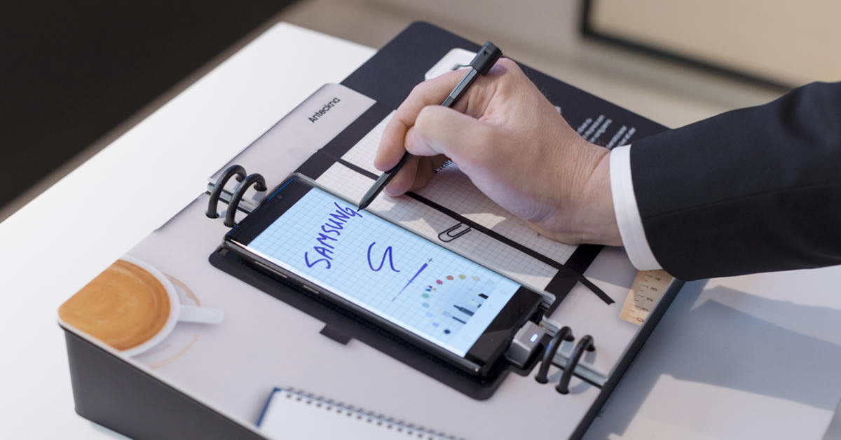
Prior to the launch of Samsung's new flagship phone Galaxy Note9 we got the assignment to create an in-store experience for retail. The experience should not just highlight the best features of this brand new phone, it should also show off the phone's integrated stylus pen, the S Pen. The challenge was to be playful, yet business oriented.
Gold winner in the POPAI Awards France, in category #electronics & high-tech counters
Prior to the launch of Samsung's new flagship phone Galaxy Note9 we got the assignment to create an in-store experience for retail. The experience should not just highlight the best features of this brand new phone, it should also show off the phone's integrated stylus pen, the S Pen. The challenge was to be playful, yet business oriented.

Together with the developers at Mobile Interaction we created an interactive " experience book". The book has the flagship phone placed and integrated in the middle. We picked 3 key features of the Galaxy Note9 and the S Pen to promote. Each feature got a spread; Notes, Drawing and Translate. When turning a page in the book, the application inside the actual phone would automatically change, also meaning the interface would change. This would all happen without any human interaction with the phone.
A great collaboration with Mobile Interaction led to a fairly simple solution, that saved a lot of production cost. By placing magnets on the inside of each book page, the magnetic field reader inside the phone made the interface change as a page in the book was flipped. A major challenge was to create a design that would "bleed" from the edges of the phone, and "spill out" onto the pages of the book. We wanted a seamless looking experience. Plus, the book should grab the attention of people browsing a lot of products in busy retail environments.
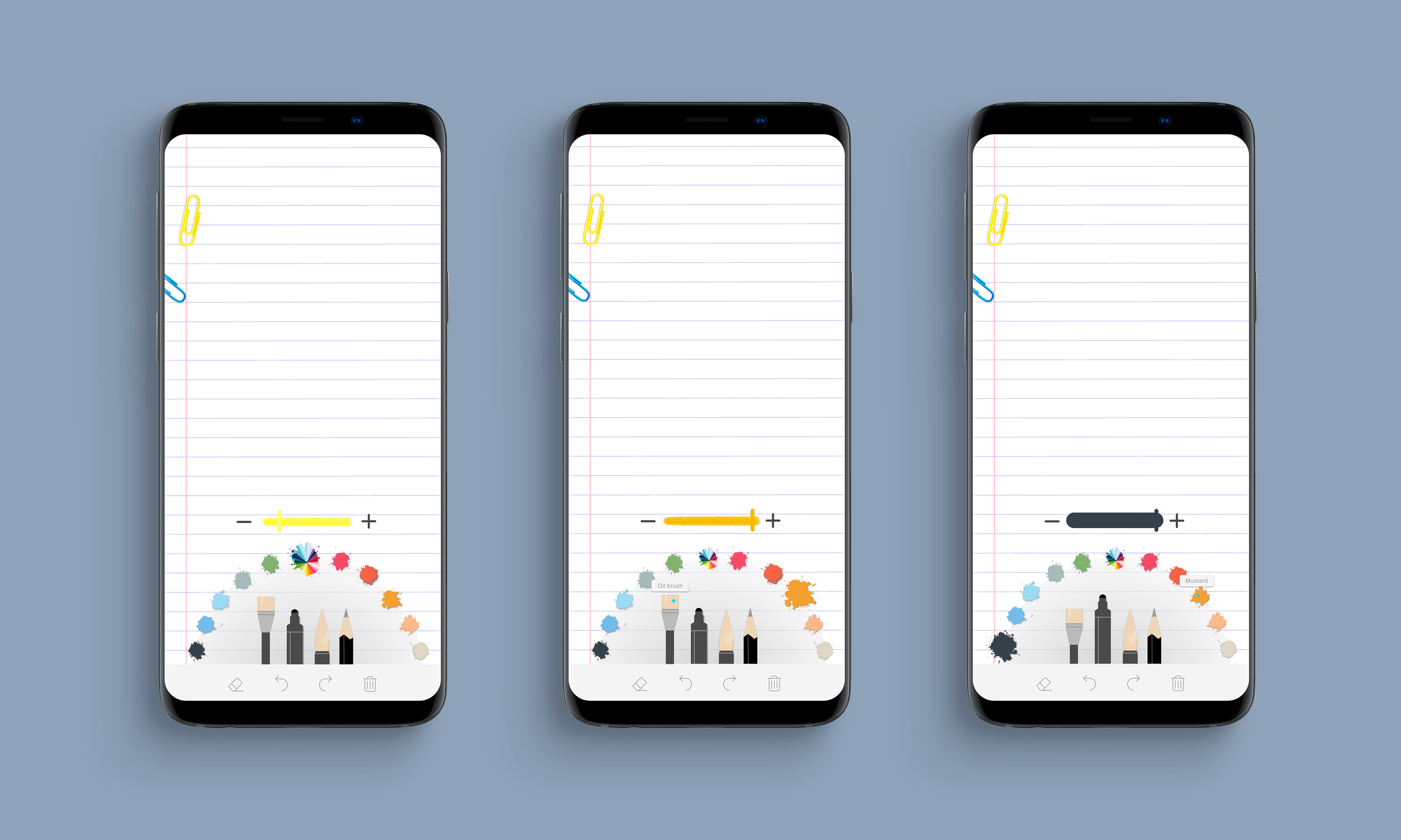
UI: Easy accessible tab bar at the bottom, color palette and different brushes/pencils


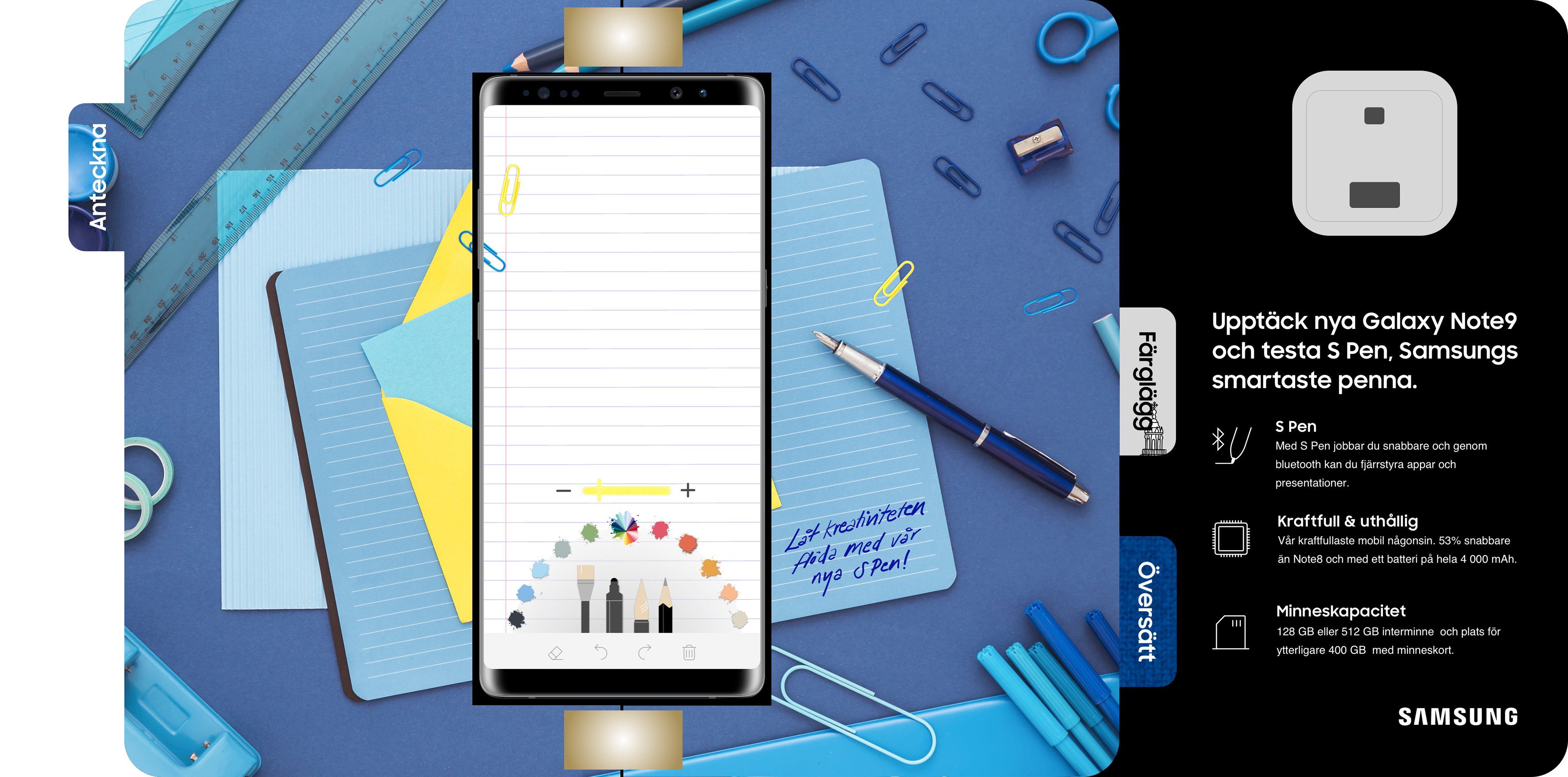
Spread 1 Notes:
A set of brushes/pencils, a limited color palette and a default stroke weight. When selecting a brush/pencil and color, the stroke changes its look and color. This indicator also helps the user change the stroke weight, by using the toggle. The original app contains a lot of pop-up menus for these settings, and provides too many options of brushes, colors, opacity etc. We wanted to simplify this UI, not to have people leaving the screen due to complexity.
A set of brushes/pencils, a limited color palette and a default stroke weight. When selecting a brush/pencil and color, the stroke changes its look and color. This indicator also helps the user change the stroke weight, by using the toggle. The original app contains a lot of pop-up menus for these settings, and provides too many options of brushes, colors, opacity etc. We wanted to simplify this UI, not to have people leaving the screen due to complexity.
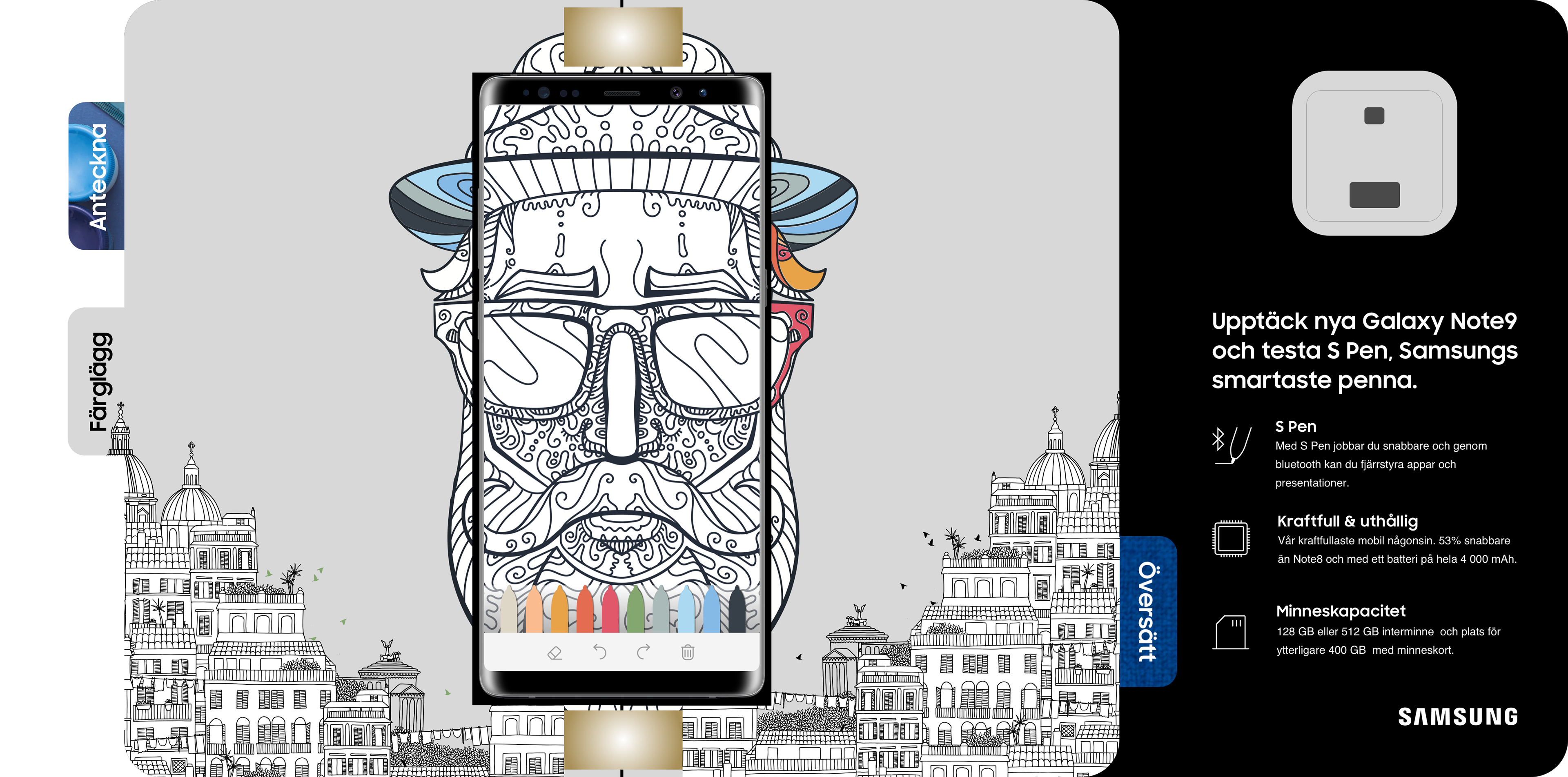
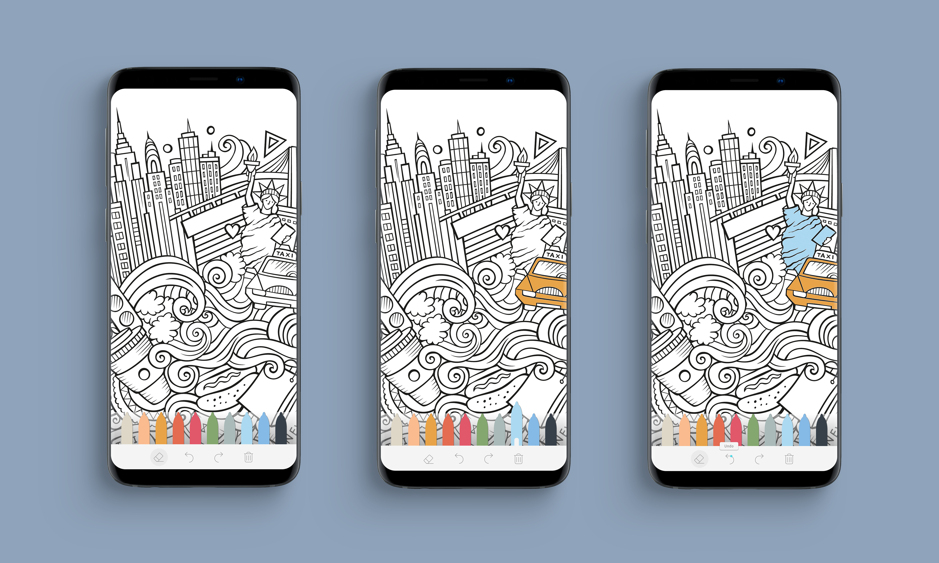
Spread 2 Mandala:
With the increasing sales of adult coloring books we were inspired to create a quirky book spread with a mandala. We let the mandala fill the whole screen and be unfilled by default. This way the user gets to be creative and experience the fun of coloring with the precise S Pen.
With the increasing sales of adult coloring books we were inspired to create a quirky book spread with a mandala. We let the mandala fill the whole screen and be unfilled by default. This way the user gets to be creative and experience the fun of coloring with the precise S Pen.
UI: Easy accessible tab bar at the bottom, pencils designed in the shape of the S Pen, using the same color palette


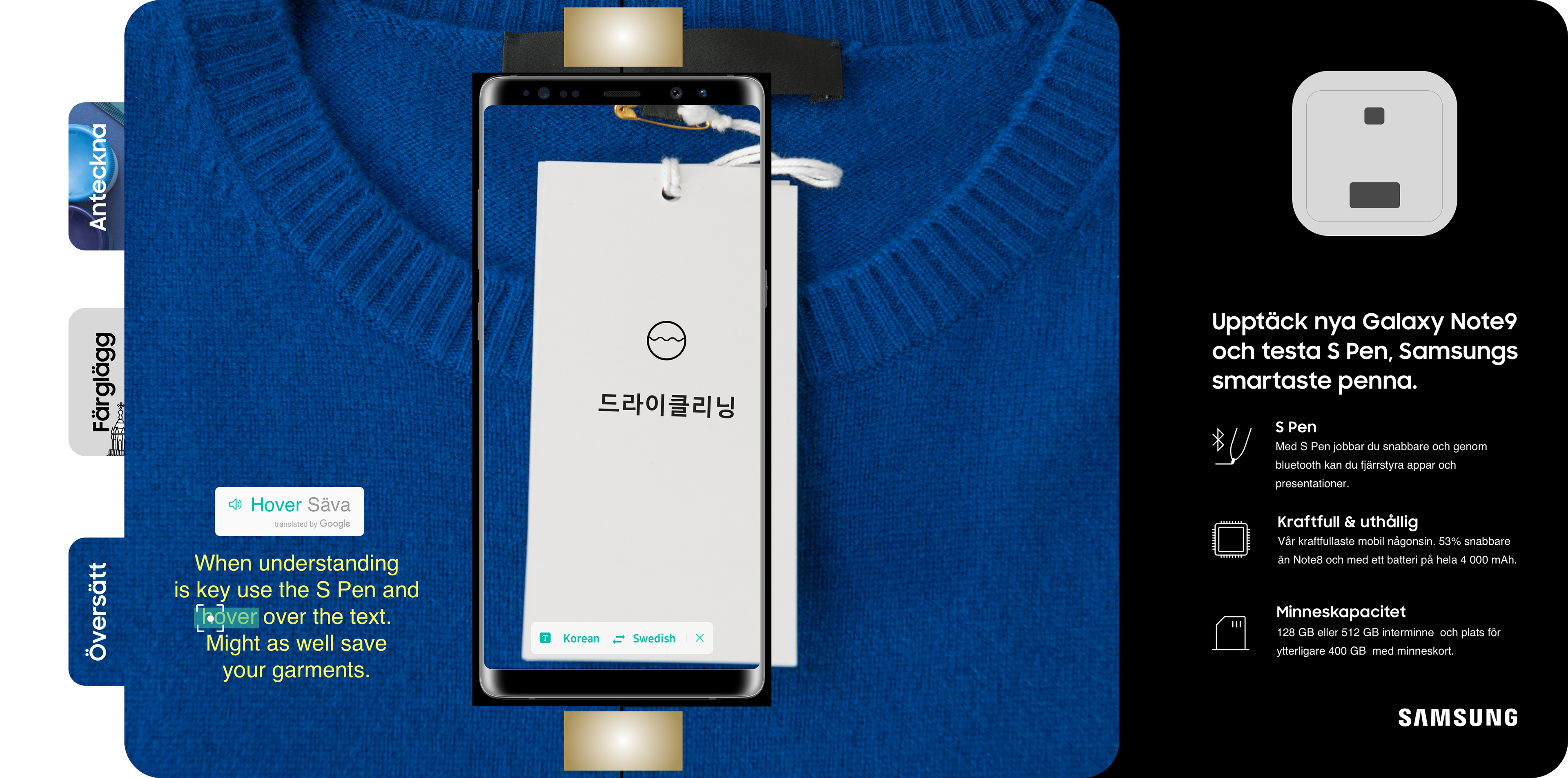
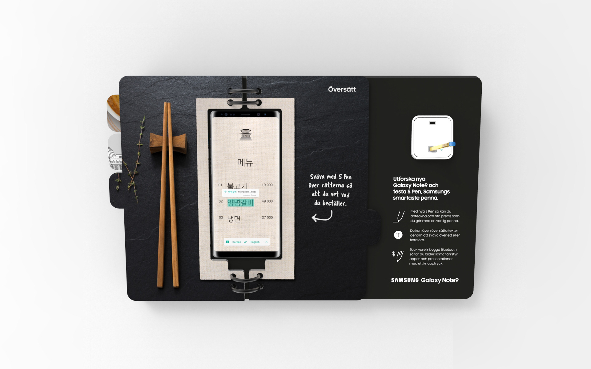
Spread 3 Translate:
The translate function does not belong to any specific app. It is coded by Google and works as an add-on feature to any app on the Galaxy Note9. We identified a lot of possible problems with keeping the experience as it was. The developers could not stop the user from leaving the current app with the solution we had now. The main issue being that the book had to work as a stand-alone in any retail environment. The solution was to fake the functions in our app, to get the user to understand how the translation feature works on the phone.
The translate function does not belong to any specific app. It is coded by Google and works as an add-on feature to any app on the Galaxy Note9. We identified a lot of possible problems with keeping the experience as it was. The developers could not stop the user from leaving the current app with the solution we had now. The main issue being that the book had to work as a stand-alone in any retail environment. The solution was to fake the functions in our app, to get the user to understand how the translation feature works on the phone.
Other challenges we faced were technical issues like avoiding screen burn and keeping the phone (and S Pen) charged and secure, without interfering too much with our physical experience of the book. We also faced questions like: How do we get users to even want to try this experience in the first place? And once they do, how do we get them to stay longer and really get interested in the product? We also had to come up with a way of preventing users from not getting lost in the rest of the phone's interface, outside of our app.
We're really excited that our experience book is nominated for the POPAI Awards in Paris, 2019!