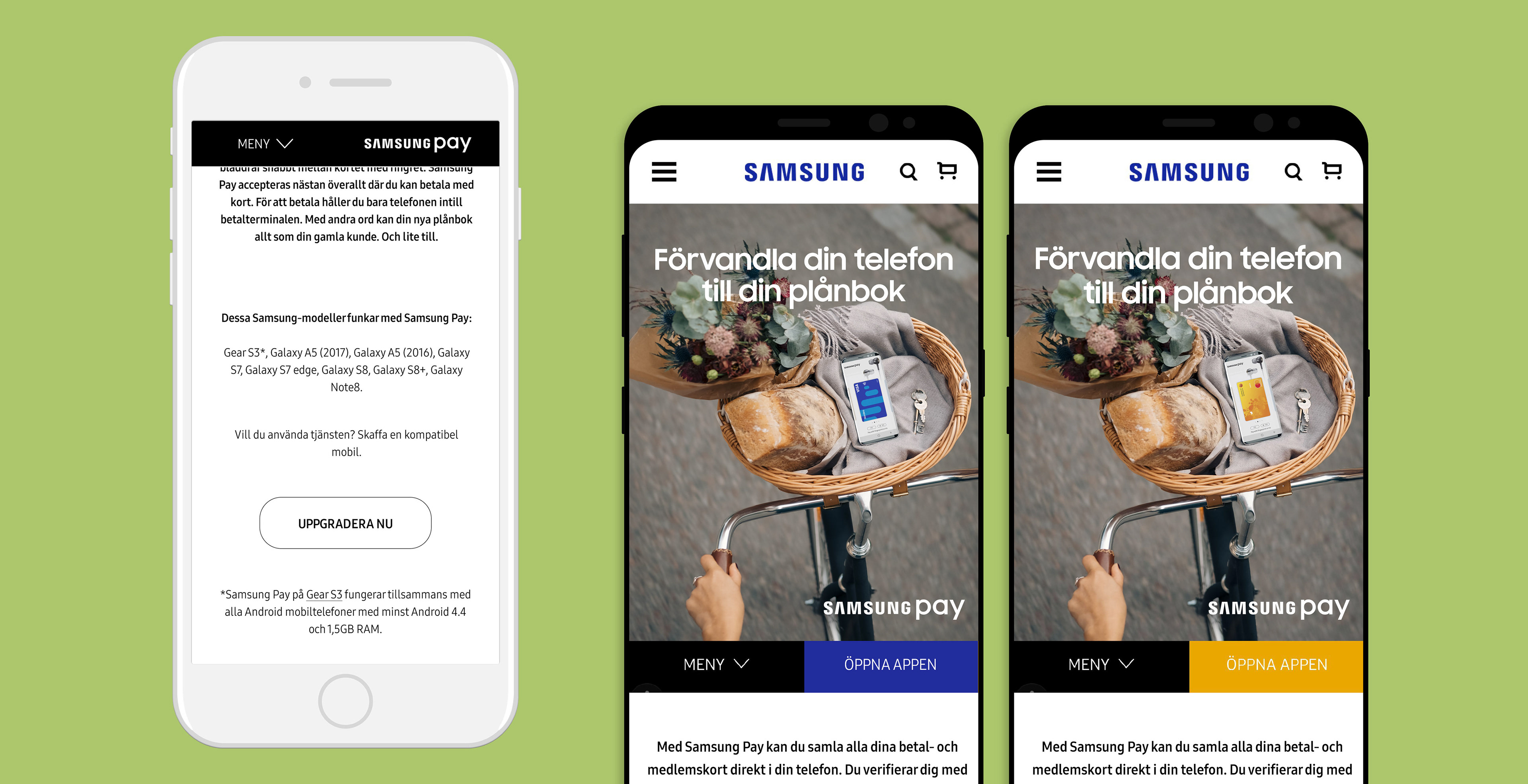
Client: Samsung | Agency: Cheil Nordic | Development: Cheil Poland
In spring 2017 we got the fun assignment to re-design the landing page for the Sweden-launch of mobile payment service Samsung Pay. The old page was way too long and content loaded slowly. This resulted in a lot of scrolling and important information got lost. Research showed that most page visitors looked for information about banks and whether or not Samsung Pay works on their phone. This is why we prioritized this information, and put it high up on the page. Further research showed that many users deleted the app, even though it came preinstalled on the new Samsung phones – a major issue.
The page has been re-designed and is constantly being updated with new information about affiliated banks and partners. The purpose of the page is to market Samsung Pay and to make people crave this service. A high goal on app downloads was set, a very good reason to optimize the page for mobile.

Both A/B-testing and conversion methods were applied to work towards the goal. As numbers showed that a lot of traffic came from iPhone users, an adaptive layout was created for possible conversion from iOS devices to Samsung. A special CTA button that only appears on iPhone, takes the user to the e-commerce page where one can purchase Samsung smartphones – all compatible with Samsung Pay, of course.
For the launch of the page we did a photoshoot, art directed by me. The key visual at the top of the page changes with the seasons and seasonal events, such as Christmas and Valentine’s. These images were created for fall 2017.


An animation instantly lets the user know that the Samsung Pay app also can hold membership and bonus cards.