Client: Swedavia Airports | Agency: Stockholm Design Lab | Development: Swedavia inhouse
Swedavia is a state held company that owns, operates and develops ten strategically important airports in Sweden. Based on Swedavia’s values, brand platform and insights fetched from extensive research, SDL has developed a sustainable creative concept, design strategy, signage, imagery and a variety of manuals. With these tools in hand, Swedavia’s airports are able to work together towards a common vision with a unified design strategy.
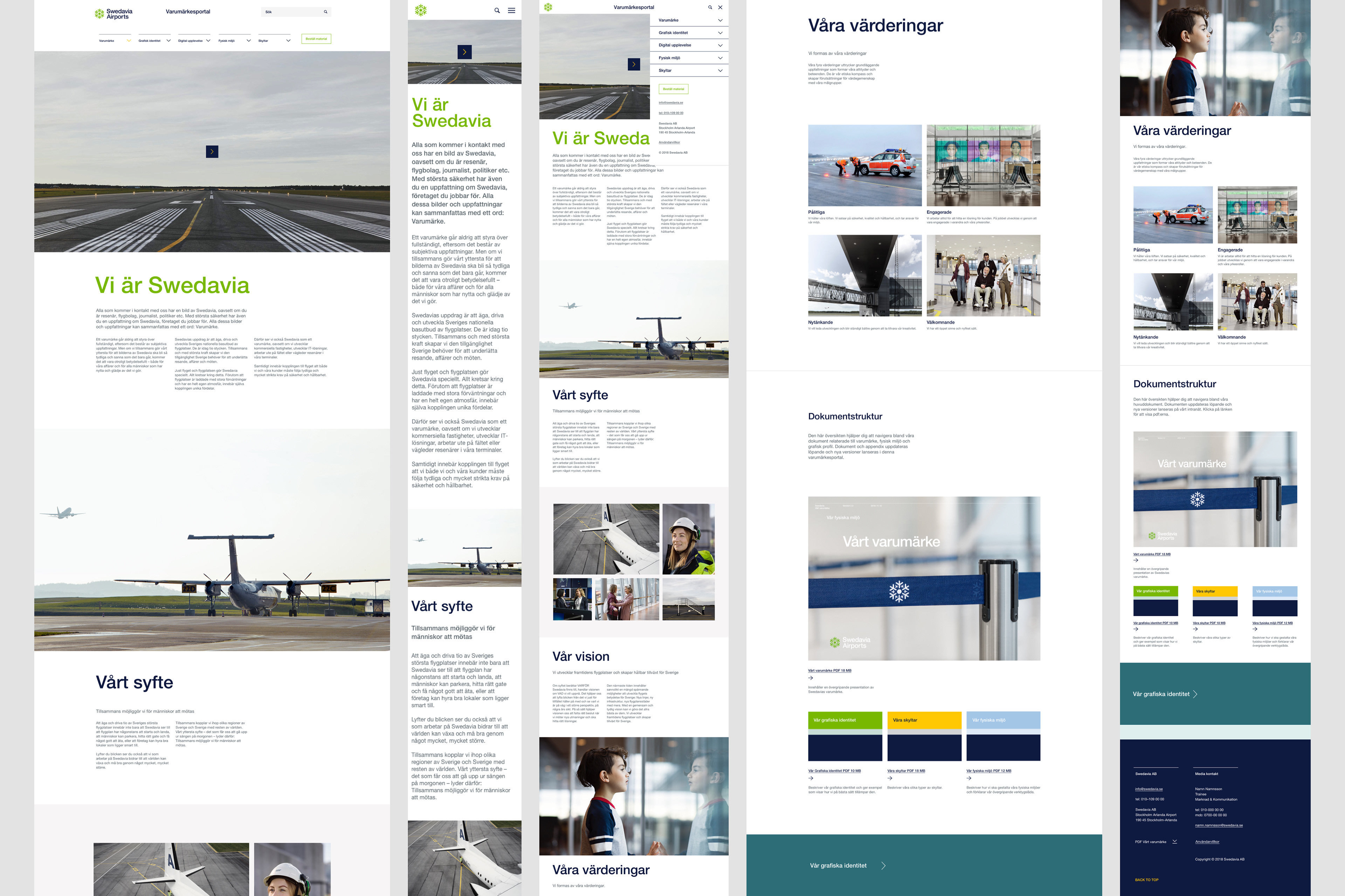
When implementing this design strategy the need for an internal brand portal where one can access all the tools; manuals, graphic assets and the full brand guidelines, became obvious. The portal should of course live in a digital environment, and be accessible to all employees working at Swedavia, including their subcontractors.
PROTOTYPE & DEVELOPMENT
I’ve been part of designing this portal from scratch. The work started out by interpreting all existing manuals (PDFs) into digital content. After understanding what needed to live on the portal I mapped it all out. Based on the user research that was done, I created user personas and then draw wireframes that quickly turned into an early prototype. From here on I’ve worked on the design and made many iterations of the prototype, alongside with developers and stakeholders. I’ve been trying out different interactions and developed UI based on Swedavias’ visual identity. I created the final visual design and handled the handover to developers.
A DESIGN SYSTEM
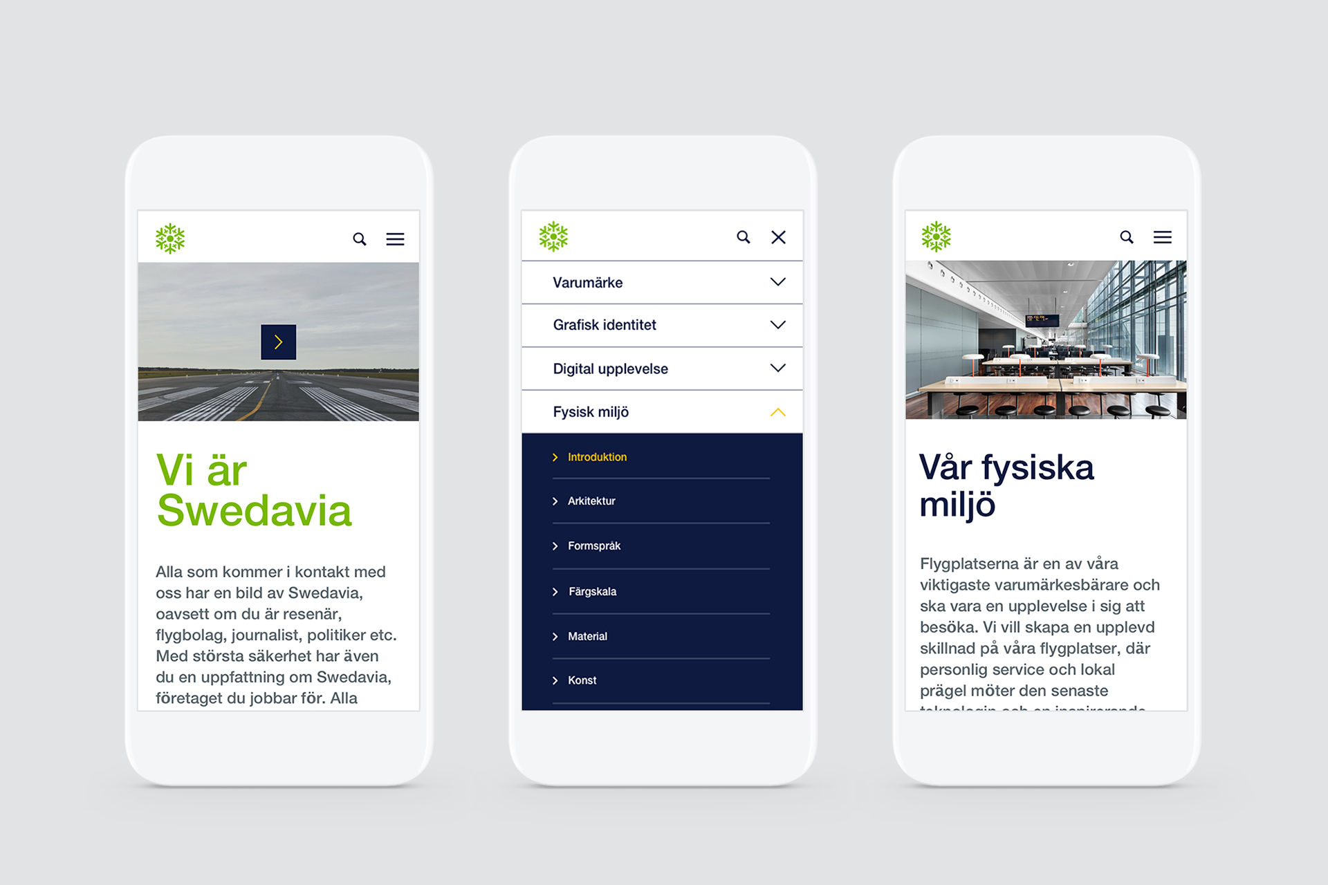
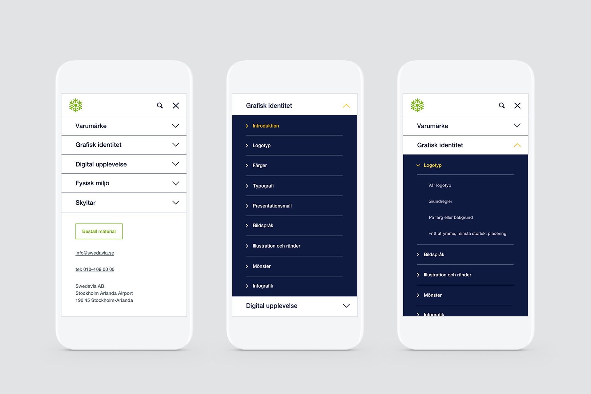
We took on a device-first-approach, meaning desktop first in this case. The portals' main user is an employee sitting at his or her desk working with something brand related like creating a PowerPoint presentation. At the same time the portal needed to work great on mobile, as ground staff at the airport might need easy access to the graphic department to be able to quickly place an order when – for instance – a sign at the airport needs to be replaced. Users should also be able to find and pass on links to often-searched-for-assets, like the logotype. We worked a lot with cross reference links and related content, throughout the portal, as some content ended up being relevant in several different departments/pages.
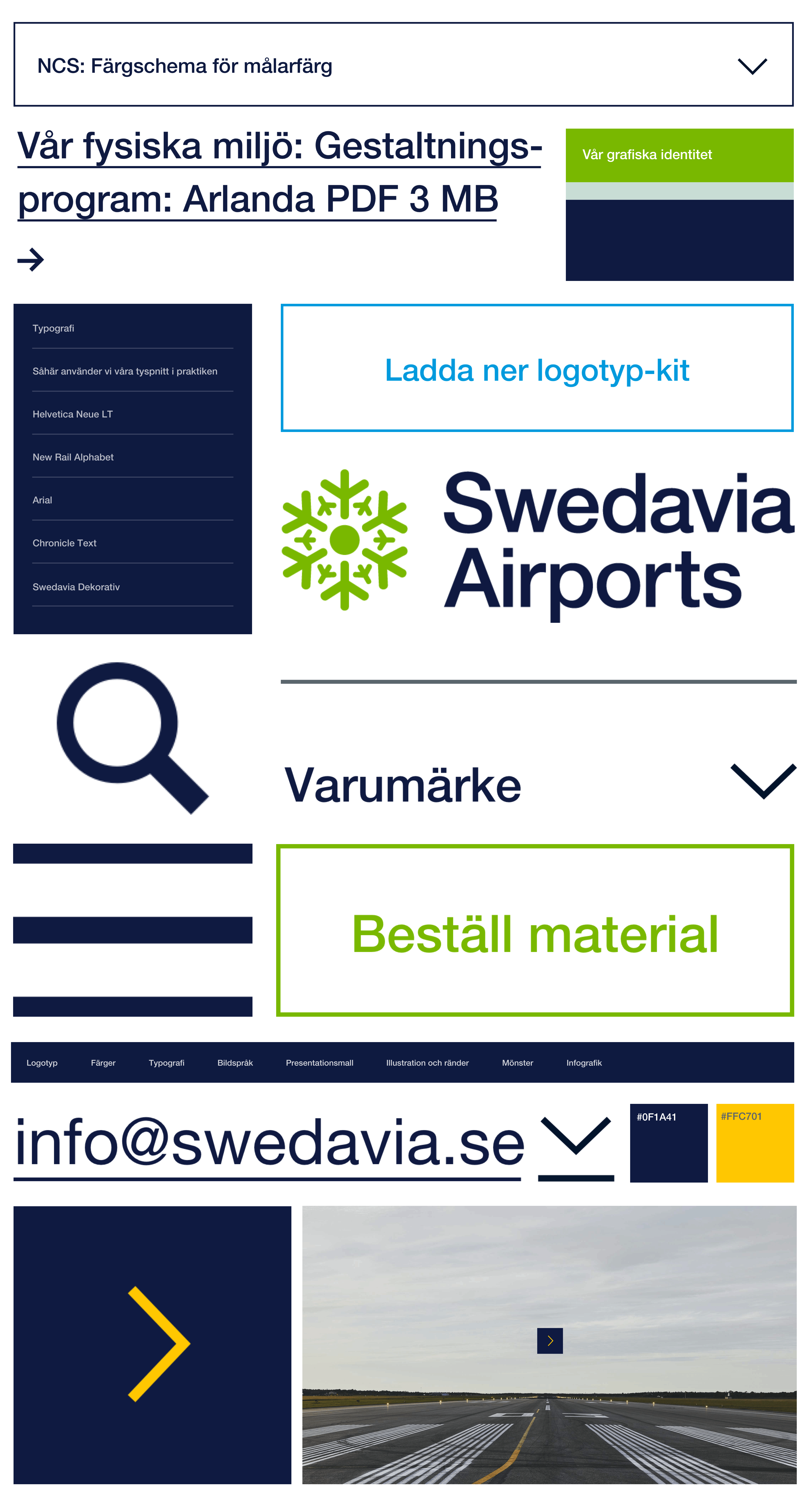
One important objective for the portal is for it to be scalable an able to grow with future needs. This means working with a design system and creating a library of digital components that can meet these requirements.
A mega menu was created to fit and display all content available. Below is the mobile navigation explained.
ONBOARDING
The portal should provide on boarding of the new brand and strategy. Some content in the portal is only accessible once an employee has actually scrolled through and confirmed that he or she has read the content. On boarding in this case means somewhat ”forcing” the user to learn some things before getting access to the rest. This way the new brand and strategy becomes important and will mean something to all of Swedavias' employees.
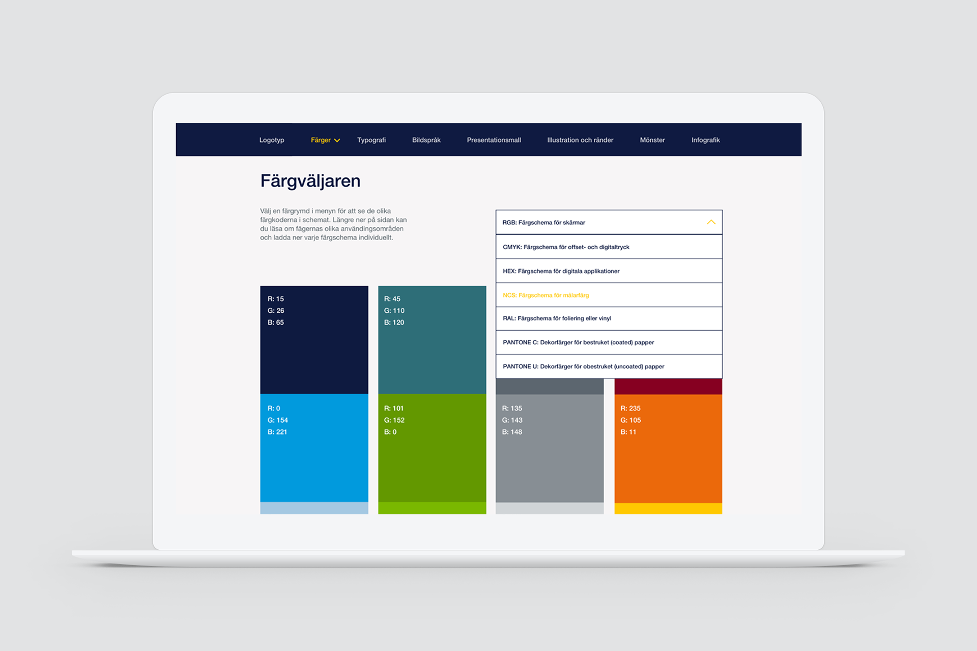
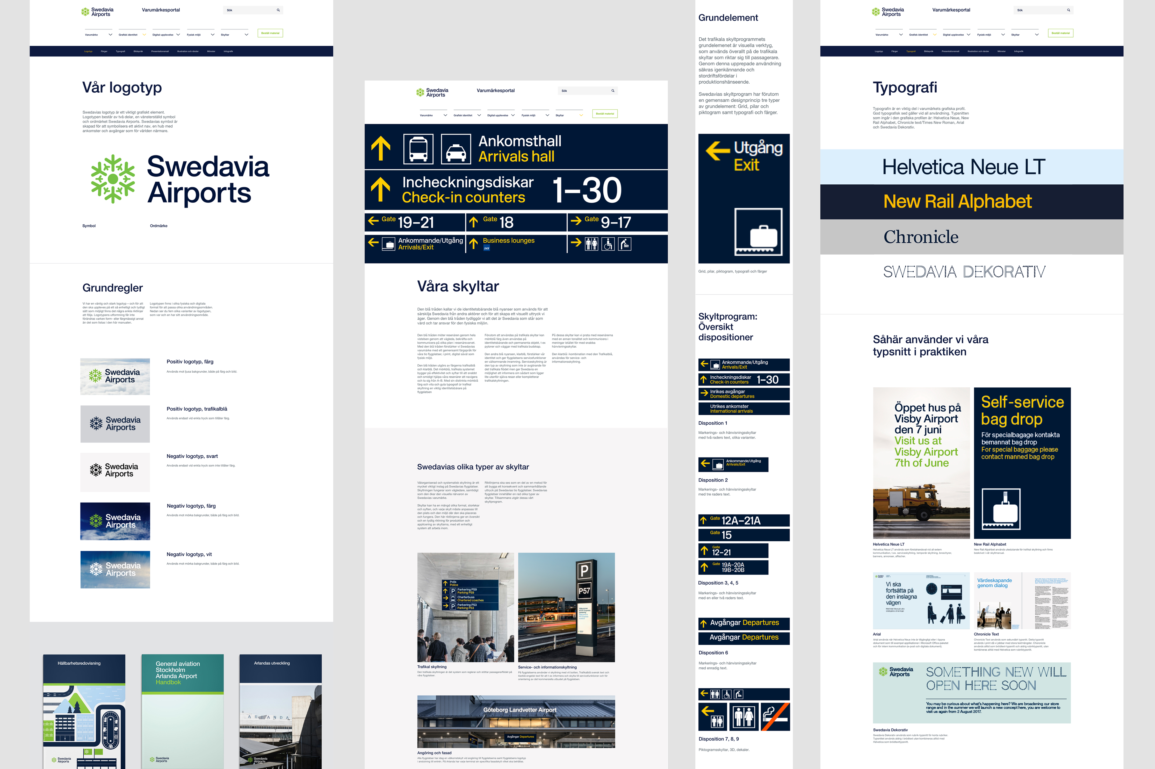
We built a function for understanding different color schemes and picking the right color codes.
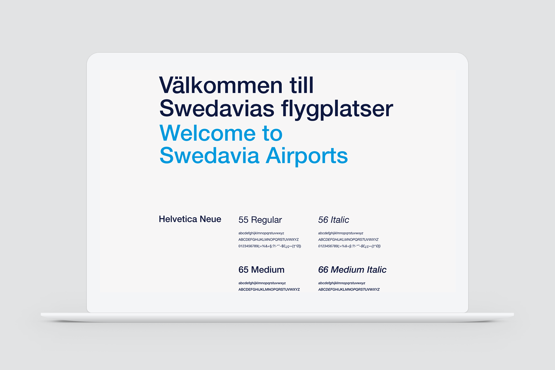
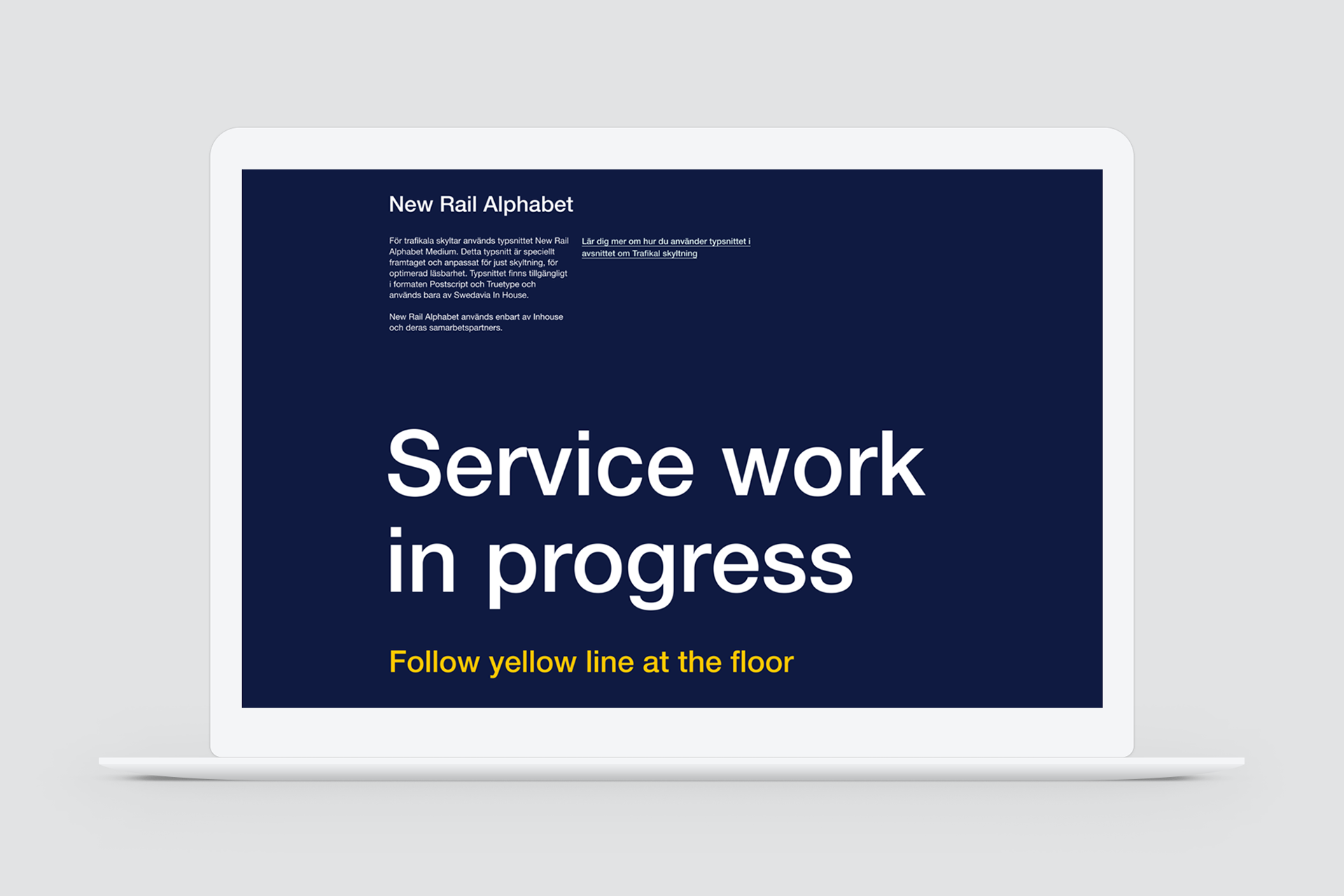
The different fonts used for Swedavias' brand are displayed and explained, all available for download.
The different fonts used for Swedavias' brand are displayed and explained, all available for download.